Creative and Innovative Navigation Designs That Users Actually Understand
Navigation is the part of a website nobody notices when it works and everybody notices when it doesn’t. You’ve probably experienced it yourself: landing on a site, looking for pricing or a contact page, and giving up after clicking through three confusing menus.
As usability expert Steve Krug put it in the title of his classic book, the goal is simple: “Don’t Make Me Think.” But simple doesn’t have to mean boring. Some of the most memorable websites use creative, innovative navigation that still feels completely intuitive. Let’s look at how to strike that balance.
Key Takeaways
- Navigation helps visitors find things, explains what you do and shows Google which pages matter most.
- Clear, familiar labels beat clever wording every time.
- Sticky headers, mega menus, bottom tab bars and Priority+ menus are proven creative patterns.
- Use crawlable HTML links, descriptive anchor text and breadcrumbs for SEO.
- Test navigation with real users, analytics and heatmaps before and after launch.
Why Navigation Design Matters
Navigation does three important jobs at once:
- It helps visitors find things. Clear menus reduce frustration and bounce rates.
- It tells people what you do. Your menu labels are a summary of your business. Someone should understand your offer just by scanning them.
- It helps search engines understand your site. Navigation links show Google which pages are most important and how they relate to each other.
That last point is easy to overlook. The links in your main menu and footer appear on every page, so they pass internal authority to the pages they point to. A well-planned navigation structure can lift the rankings of your key service pages.
Core Principles of Good Navigation
Keep it simple
Hick’s Law states that the time it takes to make a decision increases with the number of choices. Long menus with many items slow people down. Most small and medium-sized business sites work best with roughly five to seven top-level items, though there’s no magic number.
Use clear, familiar labels
Creativity belongs in the design, not the wording. “Services,” “Pricing,” “About” and “Contact” may sound plain, but visitors understand them instantly. Clever labels like “Our Magic” or “Say Hi” add friction and give search engines less useful context.
Be consistent
Navigation should appear in the same place and behave the same way on every page. Consistency builds confidence.
Show people where they are
Highlight the current page in the menu and use breadcrumbs on deeper pages. Orientation cues help visitors understand where they are and how to get back.
Prioritize by importance
Put the most important pages first and last. People tend to remember items at the beginning and end of a list best, a phenomenon psychologists call the serial position effect.
Creative and Innovative Navigation Patterns
Once the fundamentals are in place, there’s plenty of room to be creative. Here are patterns that work well when used thoughtfully.
Sticky headers
A header that stays visible as you scroll keeps navigation one click away. Smart sticky headers hide when you scroll down and reappear when you scroll up, giving content more room while staying accessible.
Mega menus
For sites with lots of content, a mega menu reveals a large panel of organized links, often with icons, images or short descriptions. Done well, they let visitors see the scope of a site at a glance.
Off-canvas and full-screen menus
A menu that slides in from the side or fills the screen with large, bold links can feel dramatic and modern. It suits portfolios, creative agencies and brands with only a few key pages.
Bottom navigation bars on mobile
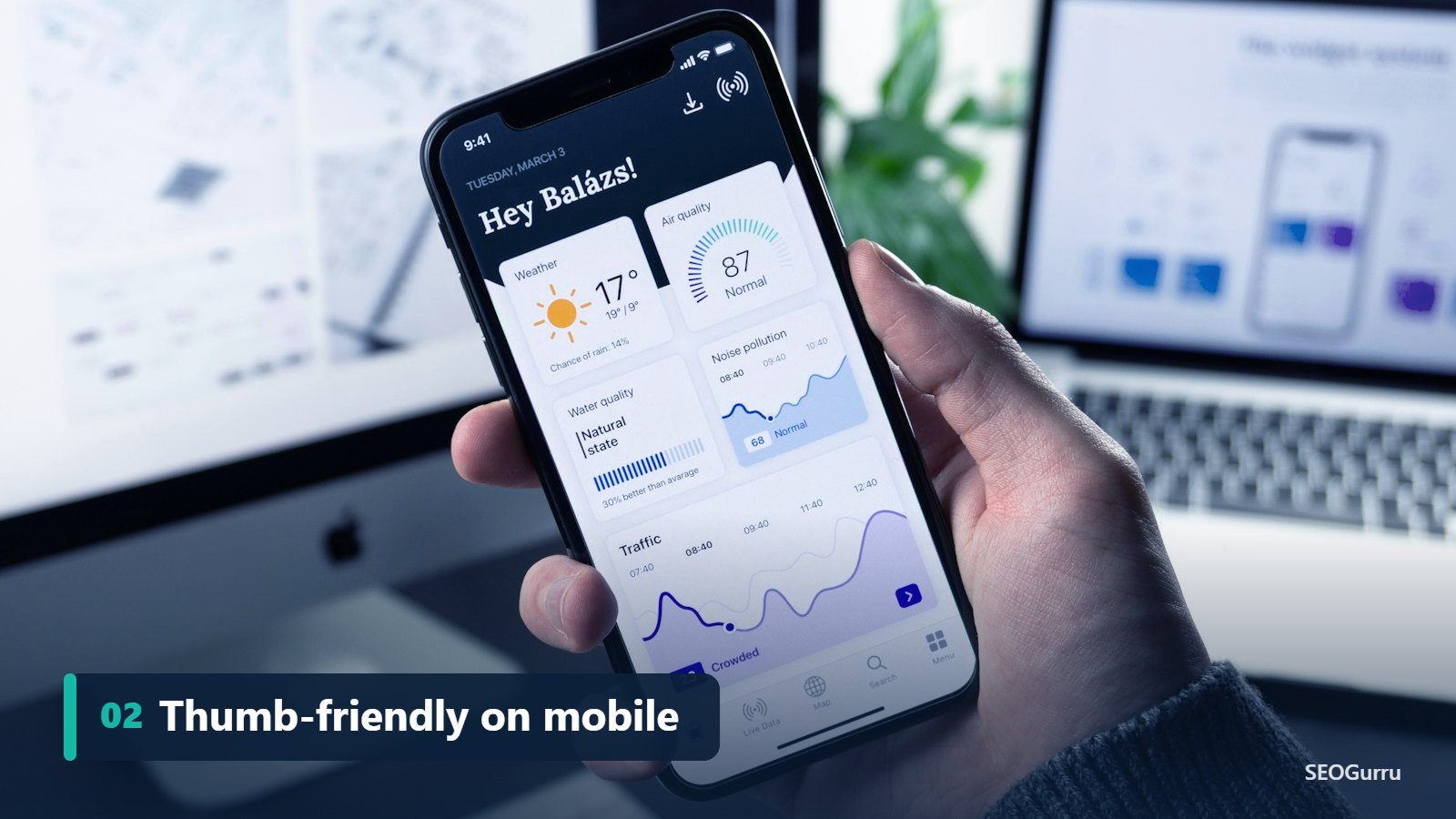
Phones keep getting bigger, but thumbs don’t. Placing primary navigation at the bottom of the screen, like the tab bars in many iOS and Android apps, makes key actions easy to reach with one hand.
Priority+ navigation
Instead of hiding everything behind a hamburger icon, Priority+ navigation shows as many items as will fit and moves the rest into a “More” menu. Visitors still see the most important links on small screens.
Scroll-triggered progress navigation
On long pages, a table of contents that highlights the current section as you scroll helps readers keep their place. It’s especially effective for guides and long-form blog posts.
Search-first navigation
For content-heavy sites and online stores, a prominent search bar with autocomplete can be the fastest route to a product. Many large retailers treat search as primary navigation.
Micro-interactions
Subtle animations, like an underline that slides under a hovered link or an icon that morphs from a hamburger into an “X,” make navigation feel responsive and polished. Keep them short and respect users who prefer reduced motion with the prefers-reduced-motion media query.
The Hamburger Menu Debate
The three-line hamburger icon is now widely recognized, especially on mobile. But Nielsen Norman Group research has found that hiding navigation, particularly on desktop, can reduce how often people use it and make content harder to discover.
A sensible approach is to show key links openly on desktop and use the hamburger on mobile, ideally with the word “Menu” next to the icon for extra clarity.
Navigation Ideas by Industry
Good navigation reflects how your specific customers think. Here are patterns that tend to work well in different industries.
Local service businesses
Plumbers, dentists, law firms and agencies should make the most valuable actions obvious. A visible phone number, a “Book Now” or “Get a Quote” button in the header, and clear service and location pages help visitors act quickly, especially on mobile.
SaaS and software companies
Software buyers often look for features, pricing, integrations and documentation. Many SaaS sites use a mega menu grouped by product or use case, with “Pricing” and “Log in” always visible. A secondary “Resources” menu can hold blogs, guides and webinars.
E-commerce stores
Shoppers think in categories, brands and needs. Clear department menus, faceted filters, a prominent search bar and a visible cart icon are essential. Seasonal links, such as gift guides, can be added temporarily without changing the core structure.
Healthcare and professional services
Trust and clarity matter most. Patients and clients look for services, locations, team bios and appointment booking. Plain labels and accessible menus are especially important because audiences may include older users or people under stress.
Publishers and blogs
Topic-based categories, tags used sparingly and a search box help readers find related content. “Popular” and “Latest” sections encourage deeper exploration and keep people on the site longer.
Common Navigation Mistakes to Avoid
Even well-designed sites fall into these traps:
- Too many top-level items, which overwhelms visitors and dilutes focus.
- Vague labels like “Solutions” or “Resources” with no hint of what’s inside.
- Hover-only dropdowns that don’t work on touchscreens or for keyboard users.
- Dropdowns that disappear too fast when the cursor drifts slightly off the menu.
- Different menus on different pages, which breaks orientation.
- Important pages hidden in the footer only, where few visitors look.
- Missing mobile search, forcing people to scroll endlessly through menus.
A quick review of your analytics and a handful of user tests will usually reveal which of these issues affect your site.
Accessibility Checklist for Navigation
Accessible navigation helps everyone, including search engine crawlers that rely on clean HTML. Before launch, check that:
- The menu is wrapped in a
<nav>element with a clear label when there’s more than one menu. - Every link and button can be reached with the Tab key in a logical order.
- Dropdowns open with Enter or Space and close with Escape.
- A visible focus outline shows exactly where keyboard users are.
- A “Skip to main content” link lets keyboard and screen reader users bypass the menu.
- The current page is indicated with
aria-current="page". - Touch targets are large enough to tap comfortably on phones.
These checks take less than an hour and can make your site usable for many more visitors.
Navigation and SEO Best Practices
- Use HTML links. Search engines follow standard
<a href>links most reliably. Avoid navigation that only works through JavaScript click events. - Use descriptive anchor text. “Local SEO Services” tells Google far more than “Learn More.”
- Keep important pages close to the homepage. Pages reachable within a few clicks are crawled more often and usually perceived as more important.
- Add breadcrumbs with structured data. BreadcrumbList schema can help Google understand your hierarchy and display breadcrumbs in search results.
- Don’t overload the footer. Footer links are useful, but hundreds of them dilute value and look spammy.
- Make it accessible. Wrap menus in a
<nav>element, make every item keyboard reachable and ensure dropdowns can be opened without a mouse.
Clear navigation can also influence the sitelinks Google sometimes shows beneath your homepage in search results, giving your brand more space on the page.
Footer Navigation: The Underrated Safety Net
When visitors reach the bottom of a page without finding what they need, the footer becomes their last chance. A well-organized footer groups links into clear columns such as Services, Company, Resources and Contact. It’s also the natural home for legal pages, privacy policies, social profiles and a short summary of your business with your address and phone number, which supports local SEO consistency.
Keep the footer helpful rather than overwhelming. A few focused groups of links work far better than dozens of keyword-stuffed anchors, which can look spammy to both users and search engines.
How to Test Your Navigation
You don’t need a big budget to find navigation problems:
- The five-second test. Show someone your homepage for five seconds. Can they tell you what you do and where they’d click next?
- Task-based testing. Ask a few people to find specific information, like your prices or a particular service, and watch where they hesitate.
- Check analytics. In Google Analytics 4, look at which pages people visit next and where they exit. Heavy use of site search can signal that navigation isn’t working.
- Heatmaps. Tools like Microsoft Clarity or Hotjar show where people click, tap and scroll.
- Test on mobile. Open and close your menu on a real phone. Is everything easy to tap?
Final Thoughts
Innovative navigation should feel like a pleasant surprise, never a puzzle. Start with clear structure and familiar labels, then add creativity through layout, motion and interaction. When navigation is easy, visitors explore more, search engines understand more and your website works harder for your business.
Not sure if your site structure is helping your rankings? Get a free SEO audit and we’ll review your navigation, internal linking and user experience.
Frequently Asked Questions
Quick answers to the questions we hear most about website navigation design.
How many items should a navigation menu have?
There’s no fixed rule, but many small and medium-sized business sites work well with about five to seven top-level items. Use dropdowns or mega menus for deeper content.
Are hamburger menus bad for UX?
Not on mobile, where they’re widely understood. On desktop, visible navigation usually performs better because people can see their options without an extra click.
Does navigation affect SEO?
Yes. Navigation links influence how search engines crawl your site, which pages they treat as most important and how internal link authority flows between pages.
What is a mega menu?
A mega menu is a large dropdown panel that shows many links at once, grouped under clear headings. It suits websites with lots of products, services or content.
What is the best navigation for mobile?
Simple, thumb-friendly navigation works best: a clearly labeled menu button, a short list of key links, a visible search option and important actions like calling or booking within easy reach.
Should my phone number be in the main navigation?
For local service businesses, yes. A visible, tappable phone number in the header makes it easy for mobile visitors to contact you and can increase leads.