
Original and Innovative Web Layouts: Modern CSS Techniques That Stand Out
Scroll through a dozen business websites and you’ll notice something: many look almost identical. A full-width hero image, a headline, three feature boxes, a testimonial slider and a footer. It’s a safe formula, but safe rarely makes anyone remember you.
An original layout gives your brand a personality before a visitor reads a single word. The challenge is to be creative without sacrificing usability, speed or search performance. The good news is that modern CSS has made innovative layouts easier to build, and easier to keep accessible, than ever before.
Key Takeaways
- Original layouts help your brand stand out, but they must stay usable and fast.
- CSS Grid, Flexbox, subgrid and container queries make creative layouts reliable on every device.
- Bento grids, broken grids, asymmetry and oversized typography are popular modern layout ideas.
- Keep HTML source order logical so screen readers and search engines read content correctly.
- Reserve space for media and avoid heavy scripts to protect Core Web Vitals.
Why Layout Matters So Much
Layout is the invisible structure that guides attention. It tells visitors what to look at first, what’s related, and where to go next. Research from the Nielsen Norman Group has shown for years that people scan web pages rather than read them word for word, often in an F-shaped pattern on text-heavy pages. A thoughtful layout works with that scanning behavior instead of fighting it.
A strong layout can:
- Make your most important message impossible to miss
- Group related content so it’s easier to understand
- Create rhythm and breathing room with whitespace
- Lead people naturally toward a call to action
- Make your brand feel distinct and confident
The Modern CSS Toolbox
For years, developers had to rely on floats, tables and positioning hacks to create anything beyond basic columns. Creative designs often fell apart on mobile. That changed with a few key technologies.
CSS Grid
CSS Grid landed in all major browsers in 2017 and transformed layout on the web. It lets you define rows and columns at the same time, place items exactly where you want them and let elements overlap. Named grid areas make complex layouts readable:
.page {
  display: grid;
  grid-template-areas:
    "hero hero side"
    "main main side";
  gap: 2rem;
}
Flexbox
Flexbox handles one-dimensional layouts beautifully, such as navigation bars, button groups and card rows. Grid and Flexbox work best together: Grid for the overall page, Flexbox for components inside it.
Subgrid
Subgrid, now supported across major browsers, lets nested elements align to their parent grid. Card titles, images and buttons in a row finally line up perfectly, even when their content is different lengths.
Container queries
Container queries let a component adapt to the space it sits in, not just the overall screen. A feature block can be wide and horizontal in a main column and stacked in a sidebar, all from the same code.
Designer and developer advocate Jen Simmons calls this new era “intrinsic web design,” where layouts respond to content and context instead of rigid, fixed breakpoints.
Original Layout Ideas Worth Trying
Bento grid layouts
Inspired by Japanese bento boxes and popularized by Apple’s product pages, bento grids arrange content in tiles of different sizes. They’re perfect for showcasing features, services or stats in a scannable way. CSS Grid makes them simple to build and easy to rearrange on mobile.
Broken grid and overlapping elements
A broken grid layout intentionally lets images, shapes or text blocks overlap or extend beyond their columns. It feels editorial and energetic, like a magazine spread. With Grid, items can share cells, and z-index controls the stacking order without fragile absolute positioning.
Asymmetrical layouts
Symmetry feels stable. Asymmetry feels dynamic. A large image on one side balanced by a smaller text block on the other creates visual tension that draws the eye. The key is balance: asymmetry still needs a clear underlying grid.
Split-screen layouts
Dividing the screen into two halves works well when you have two equally important messages, such as two product lines or “for buyers” and “for sellers.” On mobile, the halves simply stack.
Oversized typography
Sometimes the layout is the type. Huge, bold headlines can carry a hero section without any image at all, which also helps performance. The CSS clamp() function keeps giant headlines in proportion across screen sizes.
Card-based layouts
Cards remain popular because they’re modular. Each card is a self-contained piece of content: an image, title, short summary and link. They work for blogs, portfolios, case studies and product listings.
Swiss-style minimalism
Inspired by the International Typographic Style, this approach uses strict grids, generous whitespace, sans-serif type and very little decoration. It’s timeless, elegant and naturally fast-loading.
Building a Bento Grid With CSS Grid
Bento grids are one of the most requested layouts we see right now, so let’s look at how simple they are to build. The idea is a grid of tiles where some tiles span more rows or columns than others:
.bento {
  display: grid;
  grid-template-columns: repeat(4, 1fr);
  grid-auto-rows: 180px;
  gap: 1rem;
}
.bento .feature { grid-column: span 2; grid-row: span 2; }
.bento .wide    { grid-column: span 2; }
.bento .tall    { grid-row: span 2; }

@media (max-width: 700px) {
  .bento { grid-template-columns: 1fr; }
  .bento > * { grid-column: auto; grid-row: auto; }
}
On desktop, the feature tile dominates the top left, wide and tall tiles create rhythm around it, and smaller tiles fill the gaps. On mobile, everything stacks into a clean single column in source order. Because the HTML order stays logical, screen readers and search engines read the content in a sensible sequence no matter how it’s arranged visually.
Layout Patterns for Different Types of Pages
Not every page should be experimental. Matching the layout to the page’s job is part of good design.
Homepages
Homepages introduce your brand and route visitors to the right place. A strong hero, a clear value proposition and a scannable overview of services work well. This is where a bento grid or asymmetrical hero can make a memorable first impression.
Service and landing pages
These pages exist to convert. Keep the layout focused: a clear headline, benefits, proof such as case studies or reviews, and a prominent call to action. Creative touches should support the message, not compete with it.
Blog posts and articles
Readability comes first. A comfortable content width, generous line height, clear headings and supporting images matter more than dramatic layouts. Pull quotes, callout boxes and a sticky table of contents can add personality without hurting reading flow.
Portfolios and case studies
This is where broken grids, overlapping images and full-bleed photography shine. Visitors expect to be impressed, and the layout itself becomes proof of creative skill.
E-commerce category pages
Shoppers want to compare products quickly. Consistent card grids, clear filters and predictable placement of prices and buttons beat novelty every time.
Common Mistakes With Innovative Layouts
We love creative design, but we’ve also audited plenty of beautiful sites that underperform. These are the mistakes that come up most often:
- Style over substance. A striking layout with vague copy still won’t convert.
- Hidden calls to action. If visitors can’t find the “Contact” or “Buy” button, the layout has failed.
- Heavy animation libraries loaded just for a few scroll effects, hurting speed on mobile.
- Text baked into images, which search engines can’t read reliably and screen readers can’t access.
- Desktop-only thinking, where the creative layout collapses into a confusing mess on phones.
- Inconsistent spacing, which makes even an original design feel unpolished.
The fix is almost always the same: design with purpose, build with semantic HTML and modern CSS, and test with real users on real devices.
Keeping Creative Layouts Usable
Originality only works if people can still find what they need. Keep these principles in mind:
- Maintain a clear visual hierarchy. Size, color and position should make it obvious what’s most important.
- Keep reading order logical. CSS Grid lets you place items anywhere visually, but screen readers follow the HTML order. Make sure the source order still makes sense.
- Don’t hide navigation. Creative layouts shouldn’t make menus harder to find.
- Respect whitespace. Crowded layouts feel chaotic. Space gives every element room to breathe.
- Design mobile first. Many experimental desktop layouts should collapse into a simpler single column on phones.
Layouts, Performance and SEO
Google evaluates page experience through Core Web Vitals, and layout decisions affect all three metrics.
Cumulative Layout Shift (CLS) measures how much content jumps around while loading. Reserve space for images, ads and embeds by setting width and height or using the aspect-ratio property.
Largest Contentful Paint (LCP) is often the hero image. Keep it compressed, use modern formats like WebP or AVIF and avoid lazy-loading the image at the top of the page.
Interaction to Next Paint (INP) suffers when layouts depend on heavy JavaScript. Native CSS layouts are almost always faster than JavaScript-driven ones.
Semantic HTML matters too. Use one clear H1, logical subheadings and landmarks like <main>, <article> and <aside>. A beautiful layout built on meaningful HTML is easier for search engines to understand and rank.
Tools That Help You Design Original Layouts
Great layouts usually start long before code. Design tools like Figma make it easy to experiment with grids, auto layout and responsive variants, and to share prototypes with clients for feedback. Browser DevTools in Chrome and Firefox include dedicated CSS Grid and Flexbox inspectors that overlay grid lines on the page, which is invaluable when debugging complex arrangements.
For inspiration, galleries like Awwwards, Dribbble and Behance showcase experimental layouts from designers around the world. Just remember that award-winning concepts are often built for wow factor rather than conversions or SEO, so borrow ideas thoughtfully and adapt them to your own goals and audience.
From Idea to Live Page
Here’s the process we recommend for any original layout:
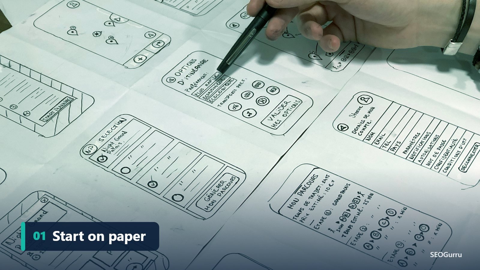
- Sketch first. Pen and paper is still the fastest way to explore ideas.
- Wireframe the content. Decide what goes where before choosing colors or fonts.
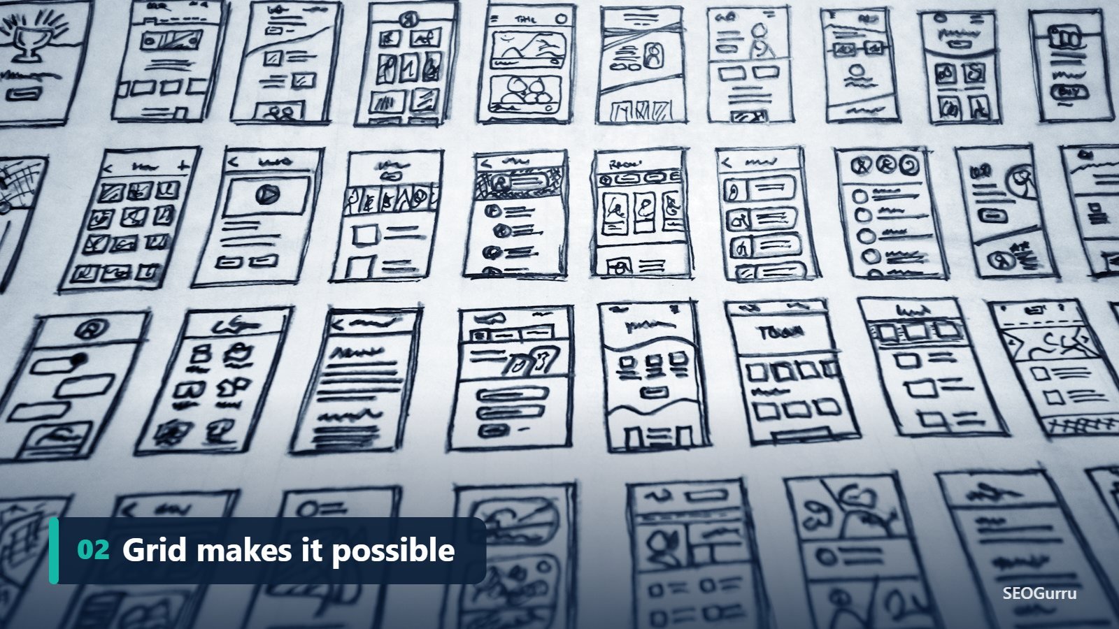
- Define a grid. Even “broken” layouts need an underlying structure.
- Build mobile first. Get the single-column version right, then expand.
- Test with real users. Watch where people click and where they get stuck.
- Measure performance. Run Lighthouse and check Core Web Vitals before launch.
Final Thoughts
An innovative layout is one of the most powerful ways to stand out online. With CSS Grid, subgrid and container queries, there’s no longer a trade-off between creativity and solid engineering. Be bold with your ideas, disciplined with your structure and always design for the person on the other side of the screen.
Want to know if your current layout is helping or hurting your rankings? Request a free SEO audit and we’ll review your site’s structure, speed and user experience.
Frequently Asked Questions
Quick answers to the questions we hear most about web layouts and CSS Grid.
Is CSS Grid better than Flexbox?
Neither is better. CSS Grid is ideal for two-dimensional page layouts with rows and columns, while Flexbox excels at one-dimensional rows or columns of items. Most modern websites use both together.
Can creative layouts hurt SEO?
Only if they slow pages down, cause layout shifts, hide content or put text inside images. Built with semantic HTML and good performance practices, creative layouts are perfectly SEO-friendly.
What is a bento grid?
A bento grid arranges content in tiles of different sizes, similar to a Japanese bento box, so features, services or statistics are easy to scan at a glance.
What is a broken grid layout?
A broken grid layout intentionally lets images or text overlap or extend beyond the usual column lines, creating an editorial, magazine-like feel while still relying on an underlying grid.
How do I make a creative layout responsive?
Design mobile first, use CSS Grid and Flexbox with flexible units, use container queries for components, and let complex desktop arrangements collapse into a simple single column on small screens.
Which web layout is best for conversions?
Layouts with a clear visual hierarchy, focused messaging, visible calls to action and social proof usually convert best. Creativity should guide attention toward the action you want visitors to take.